


The majority of consumers shop online as they don’t like to go through the hassle of going to the local store. On that note, e-commerce sites give a solution to customer’s confusion and make the whole shopping process as intuitive as possible to maximize conversion to rate. Here are some common user experience design Mistakes in e-commerce site that you should avoid while building a website.
Product Descriptions
Make sure that your product description must provide full information to your customers. It must answer each question they have in mind – detailed description, material, sizes, dimensions, weight, how and why it’s used, why they should have it and so on.
Mobile Responsive

Not having a mobile optimized e-commerce solution can be a risky mistake as the web traffic is more crooked to the mobile platform. In fact, Google drops the ranking of the website, which is not responsive. Thus, let the flow be on a desktop as well as on mobile.
Product Images
Given that consumers cannot handle the items you are selling prior to placing an order on your site, you need to do as much as you can in order to enhance and recreate that experience. Ensure to offer big enough product images on your product page or let users click it.
Unperfect Check Out
More steps you put in an item going into the cart as well as the final checkout page, the more chances the customer and abandon your cart and will not come back. Follow the ideal model. If you need to include several pages, make them as fast and simple to fill out as possible. You can also combine pages, and utilize two-column layout for specific sections for shipping and billing information.
Shipping

The majority of shipping companies provide shipping calculators on their site, and there are widgets or plugins accessible for most major shopping cart systems to see shipping charges on the site. You need to have one of them. If you can’t, you can use a flat shipping rate that is high enough to include whatever you need to ship.
Complicated Forms
Some online retailers create a long process, which goes through countless pages trying to collect lots of information before arriving the checkout. The key here is to streamline the checkout process. Make it one page along with sections, which expand as each is done. Prevent checkout process, which needs the audience to register for an account prior to proceeding to purchase an item.
Users Find Unintuitive to Navigate
Think through the navigation and categories elements before you begin putting items in your catalog. Ensure that each category has at least several products in it. Make it simple for your customers to look through the categories and move around the site.
Vague Search
Ensure that the e-commerce software you are using has a great built-in search engine. Allow your users to sort their search results according to their standard criteria and remove the items which don’t suit within a particular category.
Contact Information
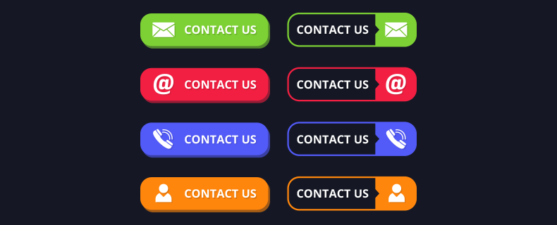
The contact information of your site is more crucial than what you think. Keep in mind that trust could be generated through several methods, not just phone numbers and contact information. Thus, if your shop is local, place your contact info in the header of the site so everyone can see it right away. In the footer, ensure at least your phone number is visible, and add your location as well.
Therefore, startups should embrace user experience design for e-commerce no matter what their budget is. It is also important to know how to satisfy the needs of your customers.