Most websites don’t fail because they look dated. They fail because visitors can’t quickly find what they came for, the page is slow on a phone, or the next step isn’t obvious. The good news is that the practices that fix this don’t change much from year to year, and none of them need a big budget.
This guide brings together the web design best practices that matter most in 2026, from planning content before you open a design tool to measuring what happens after launch. Use it as a checklist for a new site or a redesign.
Key takeaways
- Design around real content. Write (or at least outline) the words before you design the layout.
- Simple beats clever. Familiar navigation, generous white space and readable type help every visitor.
- Speed and accessibility are design decisions, not jobs for the end of the project.
- Every page needs one clear next step, and you should measure whether people take it.
1. Start with content, not a layout
Content-first design means you decide what each page needs to say before you decide what it looks like. It sounds obvious, yet many projects still start with a homepage mock-up full of lorem ipsum, then try to squeeze real text into boxes that were never designed for it. Headlines end up too long, sections sit empty, and the mobile layout breaks.
How to put content first on a real project:
- List the questions visitors arrive with (What do you offer? How much does it cost? Can I trust you? How do I start?) and make sure each one has an answer on the page.
- Design with “proto-content”: a realistic first draft of headlines, intro text and calls to action. It doesn’t need to be final, but it should be the right length and tone.
- Look at competitors’ sites to see what information people in your market expect, then decide what you can explain better.
- Bring the writer into the project early, not after the design is signed off.
A side benefit: when you design around real content you usually need fewer decorative elements, which means lighter pages and easier mobile layouts.
2. Keep layouts simple and use white space
Every extra element on a page competes for attention. A clean layout with one main message per section, a consistent grid and plenty of white space is easier to scan and feels more confident. White space isn’t wasted space: it groups related items together and separates the ones that aren’t related.
A few practical rules: keep line length for body text to roughly 60–80 characters, use one alignment system (a 12-column grid or a simple set of container widths), and give sections enough vertical spacing that each one reads as a separate idea. Complex, asymmetric grids can look great on portfolios and editorial sites, but test them on a phone before you commit.
3. Make navigation predictable and scalable
Visitors spend most of their time on other websites, so they expect yours to work the same way: logo top left linking to the homepage, main menu along the top (or behind a menu button on mobile), contact details and legal links in the footer. Creative navigation is rarely worth the confusion.
- Keep the main menu to around five to seven items and use plain labels (“Pricing”, not “Investment”).
- Plan for growth: group future pages under clear parent items so the menu doesn’t need a rebuild every time you add a service.
- Add search once you have more than a few dozen pages or articles.
- Make the most important action (book, quote, sign up) a visible button in the header, not just another menu link.
4. Treat typography as the main design element
Most of a website is text, so type choices shape how the whole site feels. Two typefaces are enough for almost any site: one for headings and one for body text (or a single family with several weights). Set body text at 16px or larger, use a line height around 1.5, and build a clear size scale so headings, subheadings and body text are obviously different.
Web fonts also affect speed. Load only the weights you use, prefer modern WOFF2 files, and set font-display: swap so text appears immediately while the font loads.
5. Use color with purpose, and check contrast
Pick a small palette: a primary brand color, an accent for buttons and links, and a range of neutrals for text, borders and backgrounds. Use your accent consistently so visitors learn what is clickable. Contrasting colors guide the eye to what matters, but only if you don’t use them everywhere.
Check every text and background pair. WCAG AA asks for a contrast ratio of at least 4.5:1 for normal text and 3:1 for large text and interface elements. Our roundup of free color tools for designers covers palette generators and contrast checkers.
6. Design for phones first
For most sites, the majority of visitors arrive on a phone. Designing the mobile layout first forces you to prioritize: what is the one thing this page must say, and what is the one action it should prompt? The desktop layout can then add space and supporting detail.
- Make buttons and links easy to tap, at least 44 by 44 pixels, with space between them.
- Avoid horizontal scrolling. Tables and code blocks should scroll inside their own box.
- Use form fields with a 16px font size so iPhones don’t zoom in, and the right input types (email, tel) so the correct keyboard appears.
- Test on real devices, not only in a resized desktop browser.
7. Make speed part of the design
A slow site loses visitors before they see your design. Google’s Core Web Vitals give you three targets to aim for, measured on real visitors’ devices:
- Largest Contentful Paint (LCP) of 2.5 seconds or less: how fast the main content appears.
- Interaction to Next Paint (INP) of 200 milliseconds or less: how quickly the page responds to taps and clicks.
- Cumulative Layout Shift (CLS) of 0.1 or less: how much the page jumps around while loading.
The biggest wins are usually design decisions: fewer and smaller images (served as WebP or AVIF at the size they are displayed), no autoplaying sliders, fewer third-party scripts, and width and height set on images so nothing jumps. Check your pages with PageSpeed Insights after every major change.
8. Give every page one clear call to action
Decide what you want a visitor to do on each page, then make that action obvious. A good call to action says what happens next (“Get a free quote”, “Book your first class”, “Download the checklist”) rather than “Submit” or “Click here”. Place it where the visitor has enough information to act, usually near the top and again after the key content.
Secondary actions are fine, but style them as secondary. If three buttons all shout, none of them gets clicked.
9. Build accessibility in from the start
An accessible site works for people using screen readers, keyboards, zoom or voice control, and it is usually easier for everyone else to use too. Most of the work is basic good practice:
- One H1 per page and headings in a logical order.
- Descriptive alt text on meaningful images, and empty alt on decorative ones.
- Visible focus styles so keyboard users can see where they are.
- Form fields with real labels, and error messages that explain how to fix the problem.
- Layouts that still work at 200% zoom.
10. Follow conventions, then add personality
Conventions exist because they work: underlined or clearly colored links, a shopping cart icon top right, contact details in the footer. Break them only when you have a good reason. You can still stand out through your photography, illustrations, tone of voice and the details: a distinctive typeface, a considered color palette, small moments of motion.
Use animation to explain, not to decorate: a menu that slides in from where the button is, or a subtle highlight when something is added to a cart. Keep it short, and respect the reduced-motion setting some visitors turn on.
11. Get the SEO basics right
Design and SEO overlap more than people expect. A clear page structure with descriptive headings, fast loading, mobile-friendly layouts and good internal links all help search engines as much as visitors. On top of that, give every page a unique title and meta description, use readable URLs, and add structured data where it fits (articles, products, local business details).
12. Measure, learn and keep improving
Launch is the start, not the end. Set up analytics to track the actions that matter (form sends, sign-ups, purchases), then look at where people drop off. Heatmaps and session recordings show where visitors click and how far they scroll; a quick five-person usability test often reveals more than weeks of guessing. Make one change at a time so you know what worked.
If you only have time for one experiment, make it your main call to action. Change the wording or where it sits, leave everything else alone for a few weeks, and compare the results with the same weeks before the change.
Quick checklist
- Real content drafted before the design is finished
- Main menu of five to seven clearly labeled items
- Body text 16px or larger, two typefaces at most
- Every text color passes a contrast check
- Mobile layout designed first and tested on real phones
- LCP under 2.5 s, INP under 200 ms, CLS under 0.1
- One clear call to action per page
- Headings in order, alt text on images, visible focus styles
- Unique titles and descriptions on every page
- Analytics tracking the actions that matter
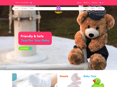
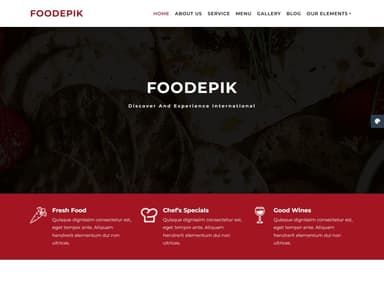
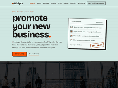
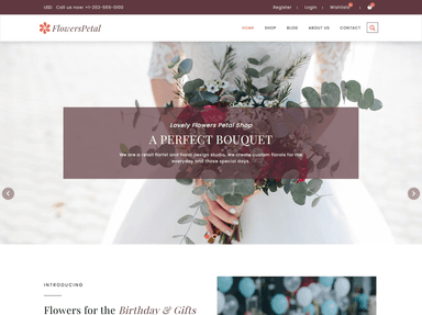
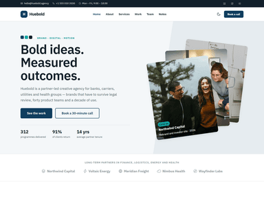
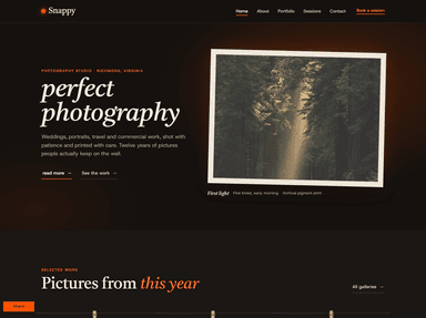
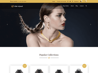
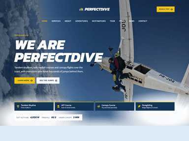
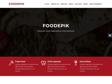
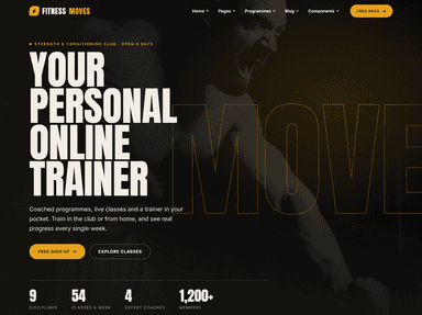
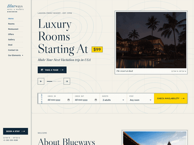
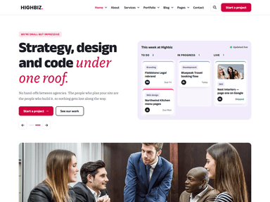
Starting from a well-built template gets you many of these for free. These recent designs from ThemeVault are a good starting point:
 FreeHTML
 PremiumAstro
 PremiumAstro
 FreeHTML
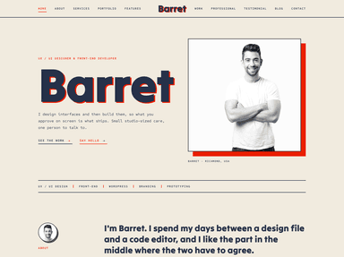
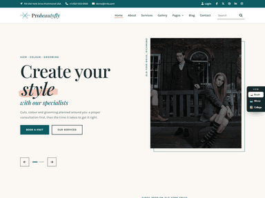
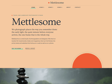 FreeHTML
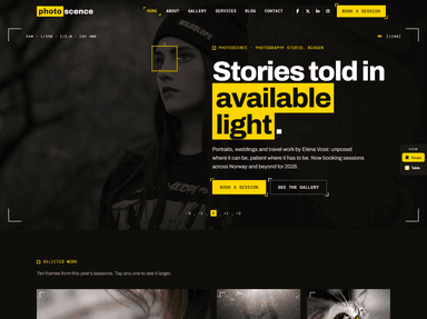 FreeHTML
 FreeHTML
Planning a redesign and would rather hand it over? Our partner agency builds and redesigns websites with these practices baked in.
Frequently asked questions
What are the most important web design best practices?
Clear navigation, readable typography, a mobile-first layout, fast loading, good contrast and one obvious call to action per page. Get those right and most other details matter much less.
What is content-first design?
An approach where you plan and draft the content of each page before designing its layout, so the design fits the real message instead of placeholder text.
How fast should a website load?
Aim for the main content to appear within 2.5 seconds on a mobile connection (Google’s “good” threshold for Largest Contentful Paint), with the page responding to taps in under 200 milliseconds.
How often should I review my website’s design?
Check analytics and speed monthly, make small improvements continuously, and plan a bigger visual refresh every three to four years or when your business changes significantly. On WordPress, add updates, off-site backups and a quick form test to that routine; here’s what a WordPress maintenance plan should cover.