Most trend lists are a mood board: pretty, and no help deciding what to actually build. This one is different. Every trend below is something we have either shipped on client and template projects or deliberately chosen not to, and each one comes with a verdict: adopt it, try it carefully, or skip it.
The short version: 2027 is less about new visual styles and more about browsers catching up with designers. Things that needed a JavaScript library two years ago are now a few lines of CSS, and the sites that feel “modern” are mostly the ones that are fast, readable and accessible.
Key takeaways
- Adopt now: native CSS features (container queries,
:has(), view transitions), speed as a design goal, accessibility by default, real imagery. - Try carefully: bento layouts, expressive variable fonts, scroll-driven animation, light personalization.
- Skip: decorative 3D heroes, voice navigation on ordinary sites, autoplay video backgrounds, scroll-jacking and chat widgets that pop up on arrival.
Trends worth adopting now
1. CSS that replaces JavaScript
The biggest shift in web design right now is invisible in a screenshot. Modern browsers support features that used to need scripts or awkward workarounds:
- Container queries let a card or widget adapt to the space it sits in, not just the screen width. One component works in a sidebar and in a full-width grid.
- The
:has()selector styles a parent based on what it contains, for example highlighting a form field group when its input is invalid, with no JavaScript. - View transitions animate between states, and increasingly between pages, so a multi-page site can feel as smooth as an app.
- Native nesting and cascade layers make stylesheets easier to organize without a preprocessor.
Verdict: adopt. Browser support for these is strong in current versions, but always check caniuse.com for the exact feature and treat animations as an enhancement that can safely be missing.
Try it: pick one component that currently needs JavaScript to change its layout, like a card grid that has to look different in a sidebar, and rebuild it with container queries. If the script can go, that’s one less file to download and one less layout jump while the page loads.
2. Speed as a design decision
Google measures real-user experience with Core Web Vitals, and since March 2024 responsiveness is judged by Interaction to Next Paint (INP): how quickly the page reacts when someone taps or clicks. A good score is under 200 milliseconds. Heavy sliders, bloated page builders and stacks of third-party scripts are the usual reasons sites miss it.
That makes performance a design question, not just a developer’s job. Choosing one web font instead of four, a static hero instead of a video, and system UI where it’s good enough are design choices that show up directly in speed and rankings.
Verdict: adopt. Set a budget before you design: for example, under 1 MB per page and no more than two font files.
3. Accessibility as the default, not a checklist
Accessible design has moved from nice-to-have to expected. In the EU, the European Accessibility Act has applied since 28 June 2025 to many online shops and digital services sold to EU customers, and WCAG 2.2 is the standard most audits use. Beyond compliance, accessible sites are simply easier for everyone to use.
- Text contrast of at least 4.5:1 for body copy.
- Visible focus states for keyboard users.
- Tap targets large enough for thumbs (WCAG 2.2 asks for at least 24×24 CSS pixels).
- Real alt text on meaningful images, and respect for “reduce motion” settings.
Verdict: adopt. It is far cheaper to design accessibly from the start than to retrofit it after an audit.
4. Real photos and custom illustration
Visitors have learned to spot both generic stock photography and generic AI imagery, and they trust neither. The sites that stand out use real team and product photos, or a consistent illustration style that clearly belongs to the brand. AI image tools are useful for exploring ideas and mock-ups; the final visuals should still look like you.
Verdict: adopt. Even a half-day photo session usually beats a year of stock images.
5. Dark mode done properly
Dark mode is no longer a novelty, but many sites still do it badly: pure black backgrounds, colors that were never re-checked for contrast, and logos that disappear. Doing it well means designing color tokens (background, surface, text, accent) with a light and a dark value each, following the visitor’s system setting by default and offering a toggle.
Verdict: adopt for content sites and tools people use for long stretches. Optional for brochure sites.
Trends to try carefully
6. Bento grids and modular layouts
Bento layouts (a grid of different-sized tiles, popularized by product pages) are a great way to show several features at once. They work when each tile has one clear message. They fail when they become a collage of equal-weight boxes with no reading order, especially on phones, where every tile stacks into one long column.
Verdict: try for feature sections and portfolios. Design the mobile order first.
7. Expressive typography with variable fonts
Oversized headlines, mixed serif and sans pairings and variable fonts (one file that covers every weight) give a site personality without extra images. The catch is weight: an unsubsetted display font can outweigh everything else on the page.
Verdict: try. Use one variable font for text and at most one for display, and subset them to the characters you need. Need ideas? Our list of free headline fonts is a good starting point.
8. Scroll-driven animation
CSS can now tie an animation to scroll position without a library: progress bars, images that fade in, subtle parallax. Used sparingly it adds polish. Used everywhere, it makes pages tiring to read and can make some visitors feel unwell.
Verdict: try, one or two effects per page, always switched off for visitors who ask for reduced motion.
9. Light personalization
Showing returning visitors what they looked at last, or tailoring a homepage by location or referral source, can lift conversions. Heavy behavioural personalization needs consent in many countries and a lot of traffic to be worth it.
Verdict: try simple, privacy-friendly versions first. Skip anything that needs tracking you would not want to explain in your privacy policy.
Trends to skip
- Decorative 3D heroes. A spinning WebGL object that takes seconds to load and says nothing about the business. Keep 3D for products people genuinely need to inspect.
- Voice and gesture navigation on ordinary sites. Great in apps and assistants; on a website, people still tap and scroll.
- Autoplay video backgrounds. Heavy, distracting, and usually unwatched on mobile data.
- Scroll-jacking. Taking control of the scroll speed or direction frustrates visitors and breaks accessibility tools.
- Chat widgets that pop up on arrival. Offer help, don’t ambush people before they have read a sentence.
How to use these trends on a real project
- Start from the job the site has to do: sell, book, inform, recruit. A trend earns a place only if it helps with that.
- Fix the foundations first: speed, accessibility and clear content. They affect every visitor; a visual trend affects the first impression.
- Add one or two signature touches, such as expressive type or a bento feature section, rather than every trend at once.
- Test on a mid-range phone on mobile data, not only on your desktop.
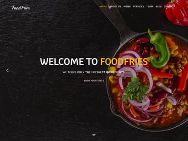
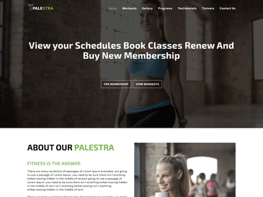
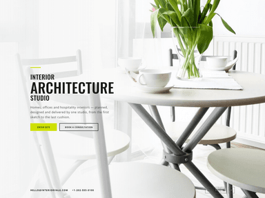
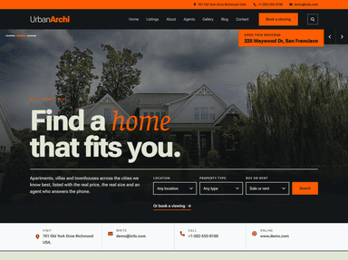
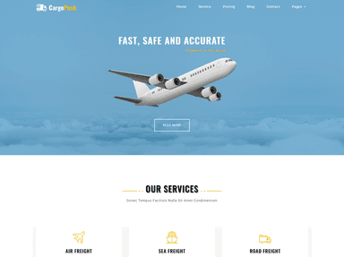
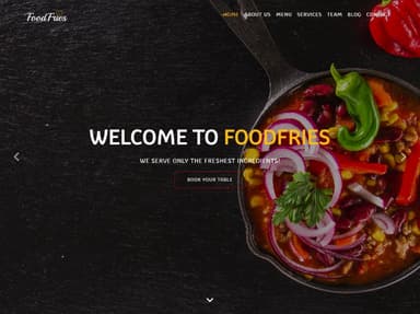
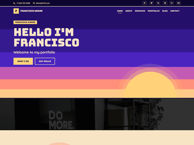
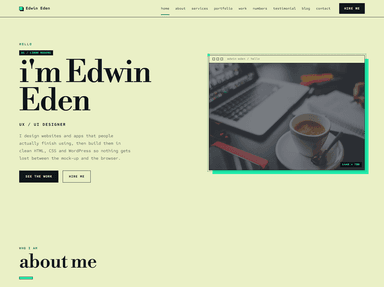
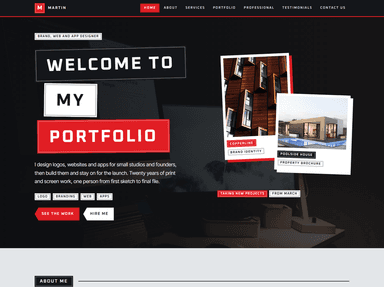
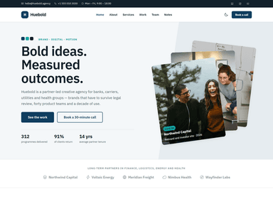
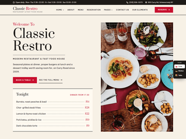
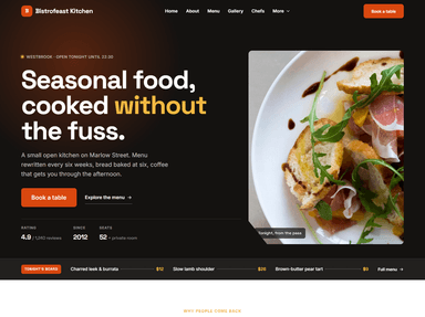
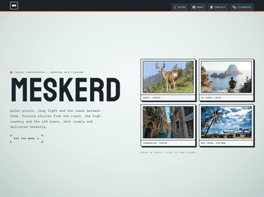
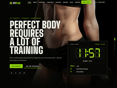
Starting a new site? A modern template gets you most of the foundations for free. These are recent designs from ThemeVault:
 FreeHTML
 FreeHTML
 FreeHTML
 FreeHTML
 PremiumAstro
 FreeHTML
 PremiumWordPress
 FreeHTML
 FreeHTML
 FreeHTML
 FreeHTML
Frequently asked questions
What is the biggest web design trend for 2027?
Using modern CSS to do what used to need JavaScript: container queries, the :has() selector and view transitions. It makes sites faster and easier to maintain, which matters more than any single visual style.
Should my small business website follow design trends?
Follow the ones that help visitors: speed, accessibility, clear layouts and real photos. Treat purely visual trends as optional, and avoid anything that slows the site down.
How often should a website be redesigned?
Most business sites benefit from a visual refresh every three to four years, with content and performance improvements every few months in between. A full rebuild is usually only needed when the platform itself is holding you back.
Last reviewed in November 2026. We update this guide as browser support and best practices change.