When people design an online store, most of the attention goes to the homepage and product pages. The checkout gets whatever time is left. That is backwards: the checkout is where the money actually changes hands, and it is where most shoppers give up.
Baymard Institute’s running average across 50 studies puts online cart abandonment at about 70%. Many of those shoppers were only browsing, but a real share leave because of the checkout itself: in Baymard’s research, 17% of US online shoppers had abandoned an order because the checkout was too long or complicated. Those are sales you can win back with better design.
Key takeaways
- Show the full price early. Surprise shipping costs and fees at the last step are a classic reason people leave.
- Offer guest checkout and ask for as few details as possible.
- Make forms easy on phones: autofill, the right keyboards, clear errors and big buttons.
- Build trust with familiar payment options, clear policies and a visible way to get help.
1. Be upfront about the total cost
Nothing kills a purchase like a total that jumps at the last step. Show shipping costs (or a shipping calculator) in the cart, mention free-shipping thresholds on product pages, and include taxes and fees as early as your platform allows. If costs depend on the address, say so and give a typical range.
2. Let people check out as a guest
Forcing shoppers to create an account before paying adds friction and raises privacy worries. Offer guest checkout as the obvious default, ask only for an email address to send the receipt, and invite people to save their details after the order is placed, when an account is a convenience rather than a hurdle.
3. Ask for less
Every field is a small reason to give up. Baymard’s benchmark found that the average checkout still shows more form fields than it needs. Practical ways to cut them:
- Use a single “Full name” field instead of separate first and last name where your systems allow it.
- Hide “Address line 2” and “Company” behind a small “Add” link.
- Default the billing address to the shipping address.
- Only ask for a phone number if you really need it for delivery, and say why.
- Use address autocomplete so people can pick their address instead of typing it.
4. Design the forms for phones first
Most shoppers check out on a phone, often with one hand. Small details make a big difference:
- Add the right
autocompleteattributes (name,email,street-address,postal-code,cc-number) so browsers can fill the form in one tap. - Use input types that bring up the right keyboard:
type="email",type="tel"andinputmode="numeric"for card numbers and codes. - Keep labels visible above each field. Placeholder text disappears as soon as people start typing.
- Validate as people go, and write errors that explain the fix (“Card number is 16 digits”) rather than “Invalid input”.
- Make the main button large, full-width on mobile, and label it with what happens next (“Pay $84.00”).
5. Keep the layout focused
Once someone starts checking out, remove distractions: hide the main navigation, promotional banners and “you might also like” sections. Keep your logo (linking back to the cart, not the homepage), a clear progress indicator if checkout has several steps, and an always-visible order summary.
One page or several steps both work well when done right. What matters is that people always know where they are, what is left, and that they can go back without losing what they typed.
6. Offer the payment methods your customers expect
Cards are the baseline, but many shoppers now expect express wallets such as Apple Pay, Google Pay and PayPal, which skip most of the form entirely. Depending on your market, local options matter too: bank transfers, buy-now-pay-later services, UPI in India or cash on delivery in some regions. Show express options at the top of the checkout so people can finish in a couple of taps.
7. Build trust at every step
- Use a well-known payment provider and show its logos near the payment fields.
- Link to your delivery, returns and privacy policies from the checkout, opening in a panel or new tab so the order isn’t lost.
- Make help easy to find: a phone number, email or chat link in the checkout header or footer.
- Keep the design consistent with the rest of the store. A checkout that suddenly looks different feels unsafe.
8. Show a clear order summary
Keep a summary visible throughout: product image, name, size or color, quantity, price, discounts, shipping, tax and the final total. On mobile, a collapsible summary at the top works well. Let people edit quantities or remove items without leaving the checkout.
9. Make the confirmation page useful
After payment, confirm clearly that the order went through, show the order number and delivery estimate, and say that a confirmation email is on its way. This is also the best moment to offer account creation (with the details already filled in) or a newsletter sign-up.
Before you change anything, place a test order yourself on a phone, as a guest, with a card you haven’t saved. Note every spot where you hesitate or have to scroll back. That list is usually a better starting point than any best-practice article, this one included.
Checkout design checklist
- Shipping costs visible before checkout
- Guest checkout is the default
- Only essential fields; optional ones hidden
- Autocomplete attributes and correct input types
- Inline validation with helpful error messages
- Express wallets at the top, plus local payment methods
- Navigation and promotions removed during checkout
- Order summary always visible and editable
- Policies and help one tap away
- Tested on a real phone with a real card
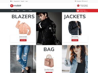
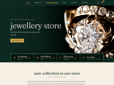
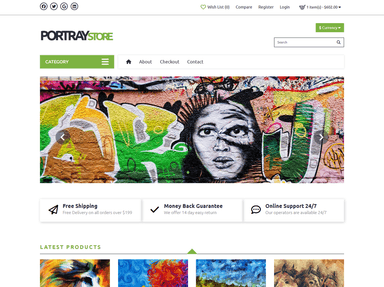
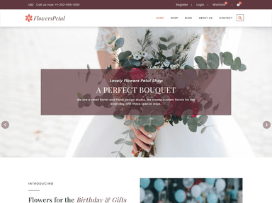
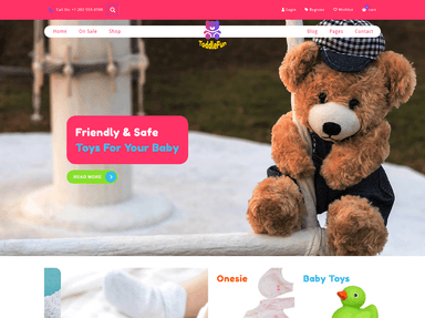
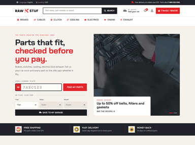
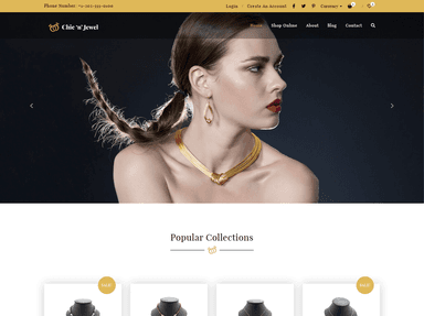
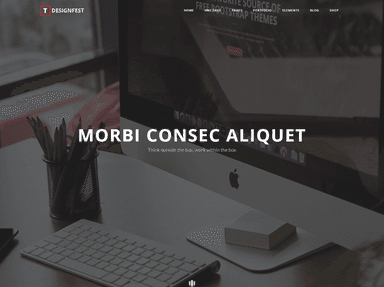
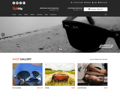
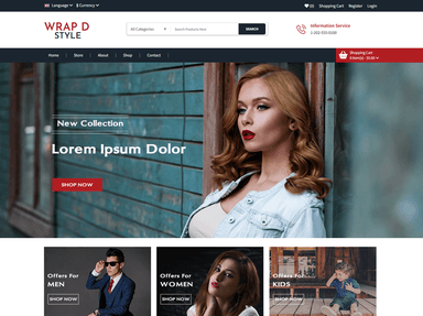
Starting a new store? These ecommerce templates from ThemeVault give you a clean base to build a good checkout on:
 FreeHTML
 FreeHTML
 FreeHTML
 FreeHTML
 FreeHTML
 FreeHTML
 FreeHTML
 FreeHTML
If you would rather have an expert review or rebuild your store’s checkout, our partner agency can help.
Frequently asked questions
Is a one-page checkout better than a multi-step checkout?
Neither is always better. A well-designed multi-step checkout can perform as well as a single page. What matters most is the number of fields, clear progress, and never losing what the customer typed.
Why do customers abandon their carts?
Many are simply browsing, but common checkout-related reasons include unexpected extra costs, being forced to create an account, a long or complicated process, and not trusting the site with card details.
Should I force customers to create an account?
No. Offer guest checkout and invite people to create an account after the purchase, with their details already filled in.