Picking colors is easy. Picking colors that work together, stay readable, pass accessibility checks and still look right in dark mode is where most projects get stuck. The good news: there is a free tool for every step of that job.
Below are the color tools worth bookmarking, grouped by what you are trying to do: find a palette, see it on a real layout, turn it into a full UI color scale, and check it for accessibility.
Key takeaways
- For a quick palette, start with Coolors or Adobe Color.
- Before you commit, preview the colors on a real layout with Realtime Colors or Huemint. A palette that looks good as five swatches often fails on an actual page.
- Always finish with a contrast check. Body text needs at least 4.5:1 against its background (WCAG AA).
Palette generators
1. Coolors
Coolors is the fastest way to explore ideas: press the space bar to generate a five-color palette, lock the colors you like, and keep generating until the rest fit. You can export to CSS, SVG or an image. The core generator is free, with a paid plan for extras.
2. Adobe Color
Adobe Color builds palettes from color-harmony rules (analogous, complementary, triad and more) on a color wheel. It can also extract a theme from a photo and has built-in tools to check contrast and color-blind safety. Handy if you already work in Adobe apps, because saved themes sync to your libraries.
3. Khroma
Khroma asks you to pick colors you like, then uses that to generate combinations in your taste, shown as text, gradients and poster layouts. Useful when you know the mood you want but not the exact colors.
4. Color Hunt
Color Hunt is a curated, community-voted collection of four-color palettes you can browse by theme (pastel, vintage, neon, earth and so on). Good for inspiration when you are starting from a blank page.
Preview colors on a real layout
5. Realtime Colors
Realtime Colors applies your text, background, primary, secondary and accent colors to a sample website as you edit them, then exports the values as CSS or Tailwind config. It is the quickest way to see whether a palette actually works for headings, buttons and body text.
6. Huemint
Huemint uses machine learning to generate palettes and shows them applied to mockups such as a brand identity, a website or a gradient. You can lock colors and adjust how adventurous the results are.
7. Happy Hues
Happy Hues is a set of hand-picked palettes where the whole site recolors itself as you browse. Each palette lists which color to use for the background, headline, paragraph, button and so on, which takes the guesswork out of assigning roles.
Build a full UI color scale
A real interface needs more than five colors: lighter and darker steps for hover states, borders, backgrounds and disabled buttons. These tools turn one color into a complete scale.
8. UI Colors
UI Colors generates an 11-step scale (50 to 950) from a single hex value, in the same format Tailwind CSS uses, ready to paste into your config or CSS variables.
9. OKLCH Color Picker
OKLCH Color Picker lets you pick colors in OKLCH, a newer CSS color format where equal steps in lightness actually look equal. That makes it much easier to build even, predictable scales. It also shows whether a color fits in the standard sRGB range or needs a wide-gamut (P3) screen.
10. Leonardo
Leonardo, an open-source tool from Adobe, works the other way round: you choose the contrast ratios you need and it generates colors that hit them. Great for design systems where every text and background pair must pass accessibility checks, including in dark mode.
Check accessibility
11. WebAIM Contrast Checker
WebAIM’s Contrast Checker is the simple, reliable standard: enter a text and background color and it tells you whether the pair passes WCAG AA and AAA for normal and large text, and for interface components.
12. ColorBrewer
ColorBrewer was built for maps but is just as useful for charts and dashboards. It offers sequential, diverging and categorical palettes and can filter for color-blind-safe and print-friendly options.
Picking colors from your screen
You probably don’t need a separate eyedropper app any more. Chrome, Edge and Firefox all include a color picker with an eyedropper in their developer tools. On Windows, Microsoft PowerToys includes a system-wide Color Picker (Win + Shift + C by default), and macOS ships with Digital Color Meter in the Utilities folder.
A simple workflow that works
- Start from one brand color, usually the one in your logo.
- Find partners for it in Coolors or Adobe Color: one neutral for text and backgrounds, one accent for buttons and links.
- Preview the result in Realtime Colors and adjust until headings, text and buttons all feel right.
- Generate scales for your main colors with UI Colors or the OKLCH picker.
- Check every text and background pair with WebAIM, in light and dark mode, before you hand the palette to development.
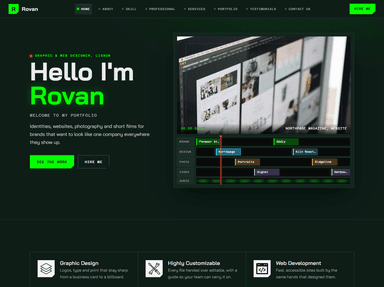
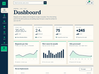
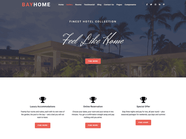
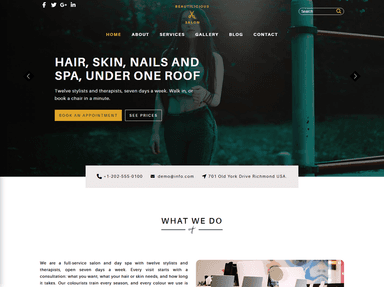
Once your colors are set, a well-built template saves you the rest of the design work. These recent designs from ThemeVault are easy to recolor:
 PremiumWordPress
 FreeHTML

 FreeHTML
 FreeHTML

 PremiumAstro
 FreeHTML

 FreeHTML
Frequently asked questions
What is the best free color palette generator?
For speed, Coolors. For palettes based on color theory or taken from a photo, Adobe Color. For seeing colors on a real layout straight away, Realtime Colors.
How many colors should a website use?
Most sites work well with one primary brand color, one accent, and a range of neutrals for text, borders and backgrounds, plus separate colors for success, warning and error messages.
What contrast ratio do I need for accessible text?
WCAG AA asks for at least 4.5:1 for normal text and 3:1 for large text (about 24px, or 19px bold) and for interface elements such as button borders and form fields.